Background
Nowadays, more and more people read news on social media using mobile phones. The trend has posed challenges to the traditional news industry. We researched and summarised the three challenges below:
- How to transport content from printed newspapers to digital platforms?
- How to report the same news in different forms on different platforms?
- How to prevent fake news circulation?
News Partner
The news partner of our project is TODAYonline, a local Singapore news provider. Upon communicating with TODAYonline, we learned that TODAYonline wanted to have a tool to help expand its reach among young people in Singapore. We summarised our partner's requirements below.
- Target audience: 21-34 years old with a "millennial" mindset.
- Goal: Encourage positive and constructive engagement on social media.
- Parameters:
- Not membership-based products, i.e., the product should not require a subscription
- The product is suitable for a small team to operate and maintain.
User Insights
By conducting primary and secondary research (Google Forms survey and user interviews), we concluded three user personas of TODAYonline.
User Persona 1: Marc, a busy young working adult- Values productivity and efficiency.
- Browses the news while having meals.
- Browses the news while having meals.
- Passionate about social causes.
- Actively comments about current affairs on social media.
- Reads before bed.
- Browses the news when traveling.
- Does not actively search for news.
- Reads whatever catches her attention on social media.
Due to the time constraint (8 weeks), we decided to focus on Alice when developing our product. Same as Alice, we were university students ourselves. Therefore, focusing on Alice was more realistic for us, especially for later design processes like user testing.
Based on Alice, the user persona of a university student, we formed our problem statement below:
The overly stimulated millennial needs a way to consume news targeted to their needs because they do not dedicate time to reading the news.
We then came up with several “How Might We…” questions below:
How Might We...
- make news more fun to get Alice to read more news?
- make news reading less time-consuming so Alice can consume more news?
- get Alice to actively search for news?
Prototyping
Upon defining our problem statement and the “How Might We” questions, we brainstormed possible solutions for these questions and recorded them on stickers. Then, we selected from the stickers to form a user journey in the storyboard below.
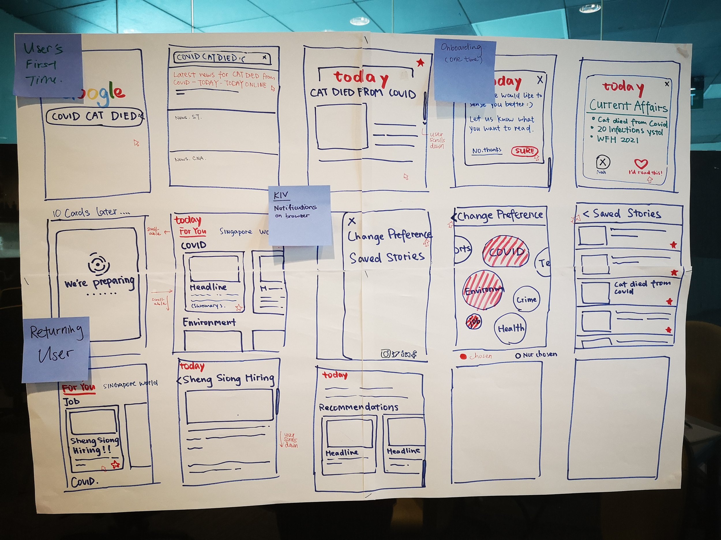
We were inspired by Instagram and Tinder, which used swiping interactions to deliver short messages, effectively grabbing users' attention. This swiping interaction also fits well with our goal: to attract the attention of millennials who browse information on mobile devices in fragmented time. Therefore, in the storyboard ideas, we decided to prioritize the development of news summary cards and swiping functions.
We named our product "SwipeX", which is a web application easily integrated into the TODAY Online website. Its features include:
- Bite-size information: news image, headline, and summary in one card; news cards of a day are randomly selected from the news database (will be customized if users spend sufficient time on the product).
- Swipe left/right to go to the next/previous card.
- Swipe up to read the whole news article.
- "Hide" and "Like" buttons for the user to express his/her news preference (can help achieve news customization).
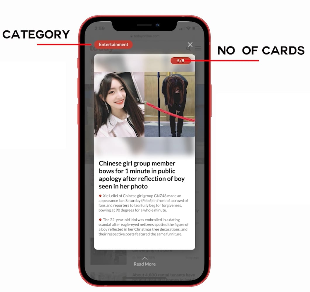
- Category tag on the top left of the card to help the user identify whether the news is interesting for him/her.
Prototype
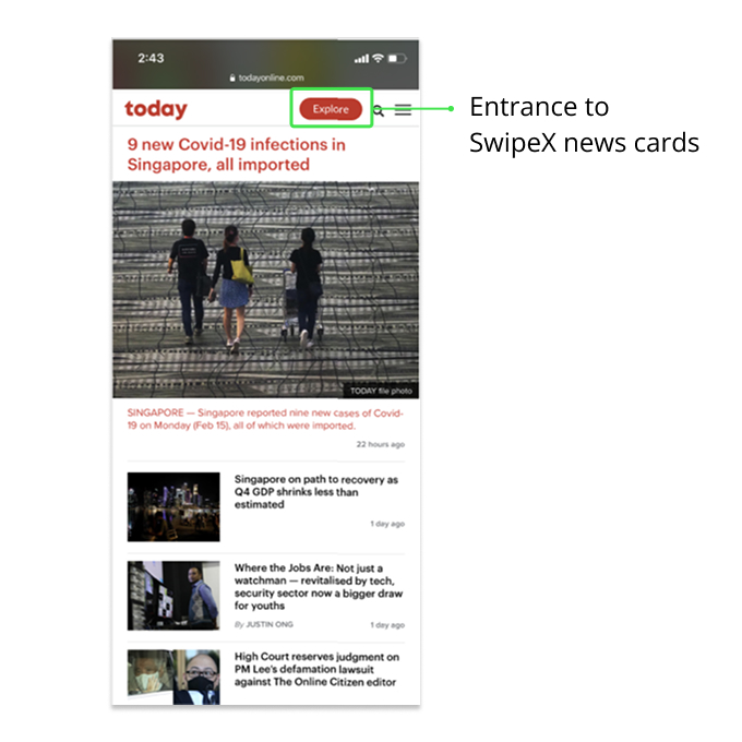
The "Explore" red button on the top right of TODAY Online website is the entrance to SwipeX. It features the same red color as TODAY Online logo and the same typeface of the website content, which allow it to seamlessly integrate into the existing web interface.
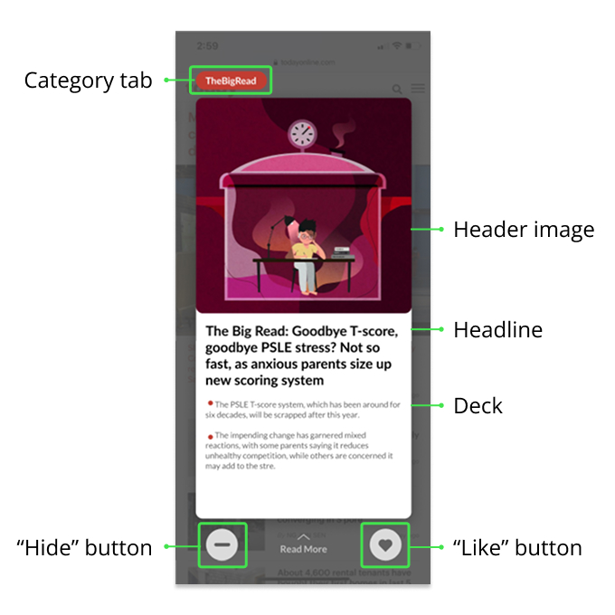
Upon tapping on the "Explore" button, user sees the news summary card. It features:
- Category tab: a category tab on the top left of the interface, showing the current news category.
- News summary card: a news summary card centered in the interface, which consists of a header image, a news headline, and one to two paragraphs as news deck.
- "Hide" and "Like" buttons: the "Hide" and "Like" buttons below the news card enable feedback from user. By tapping on the two buttons, user expresses their news preferences, which will be recorded in website Cookie. The preference information is received by the algorithm in the back-end, so that the news cards in the future will cater to user preferences.
- Swipe up to read more: if user is interested in the news upon browsing the news summary card, they can swipe up to read the full news article.
Iteration
Upon finishing the first prototype, we conducted rounds of user testing, recording and observing user interactions with out prototype.
User Testing
- Users didn't understand the functions of the "Hide" and "Like" buttons. Some users also pointed out that the "Like" button sometimes can have inappropriate meaning (e.g., a "Like" button under news about wars).
- Users could not tell how many cards there were, worrying about having an infinite number of them.
- The "Explore" button on the main page to open our swipe cards is hard to notice.
With these user insights in mind, we iterated over our prototype to level up the affordance of our product.
Iteration Result
We removed "Hide" and "Like" buttons due to their unclear and sometimes inappropriate meanings to users.
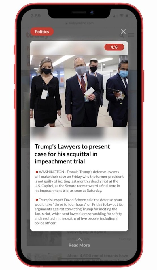
In addition to the category labels, we also marked the current card number and the total number of cards in the upper right corner of each news card. This way, users know how many cards are available to read.
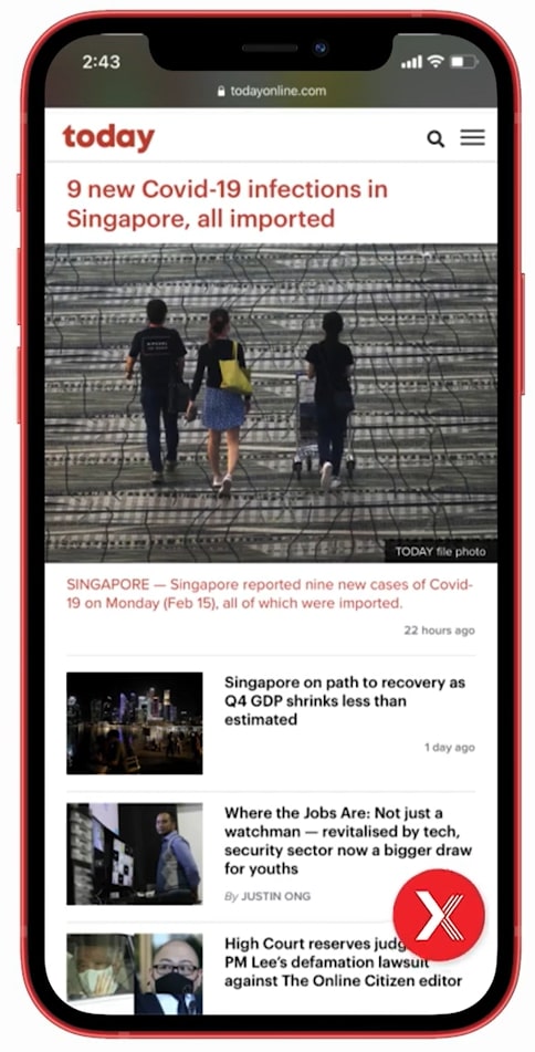
We also changed the entrance to SwipeX to a red floating bubble, making it stand out on the screen and inviting users to interact with it.